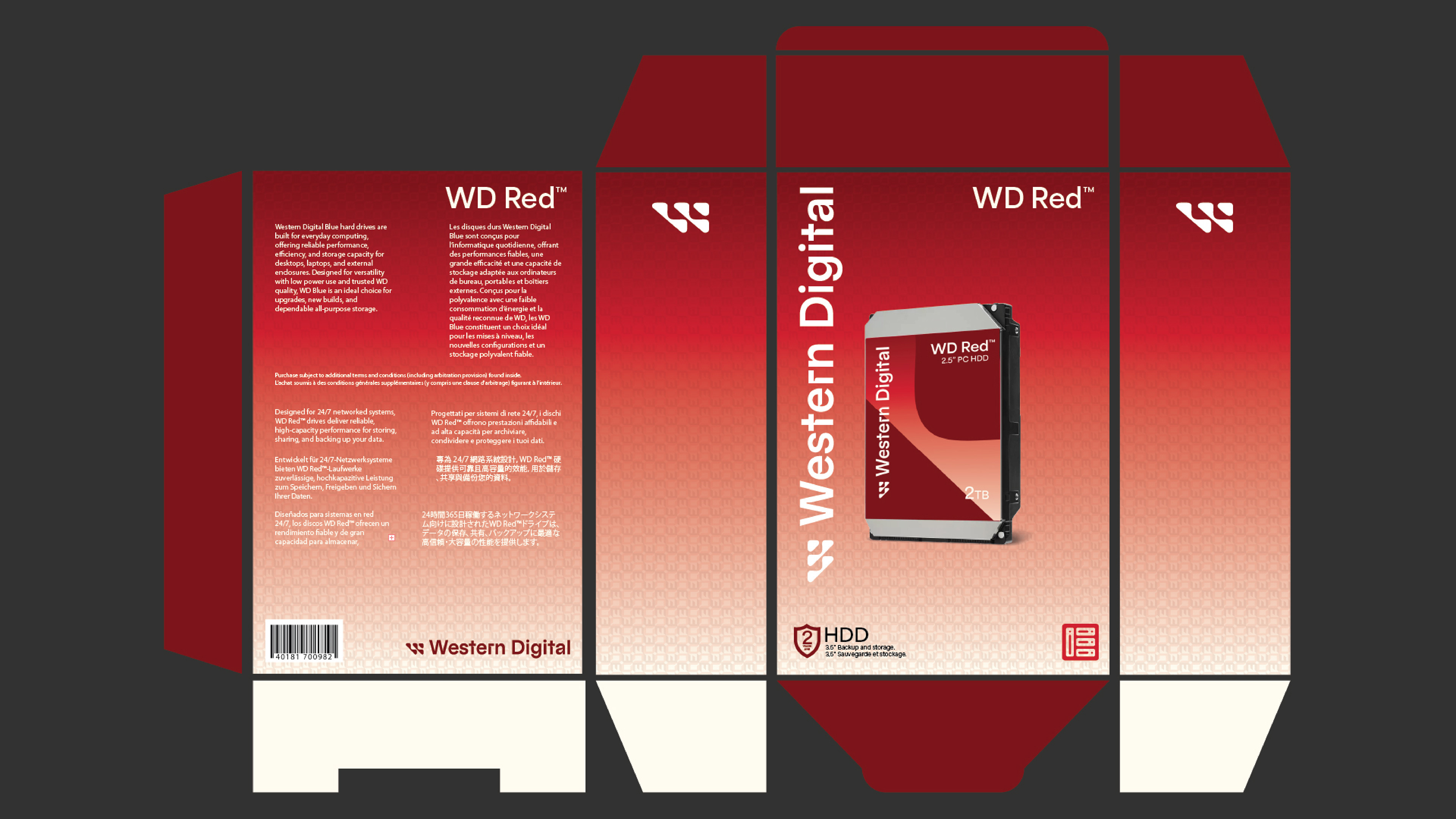
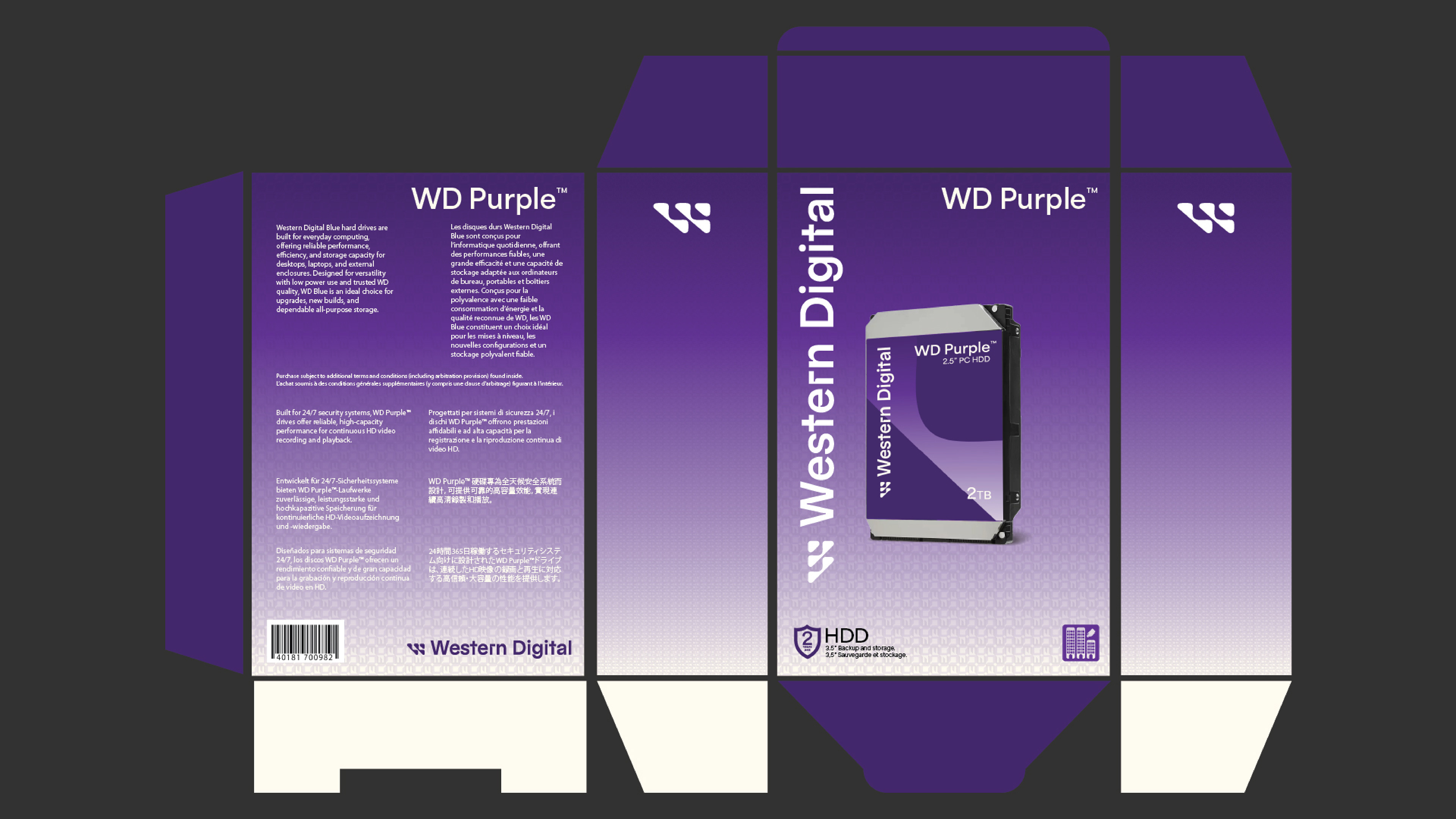
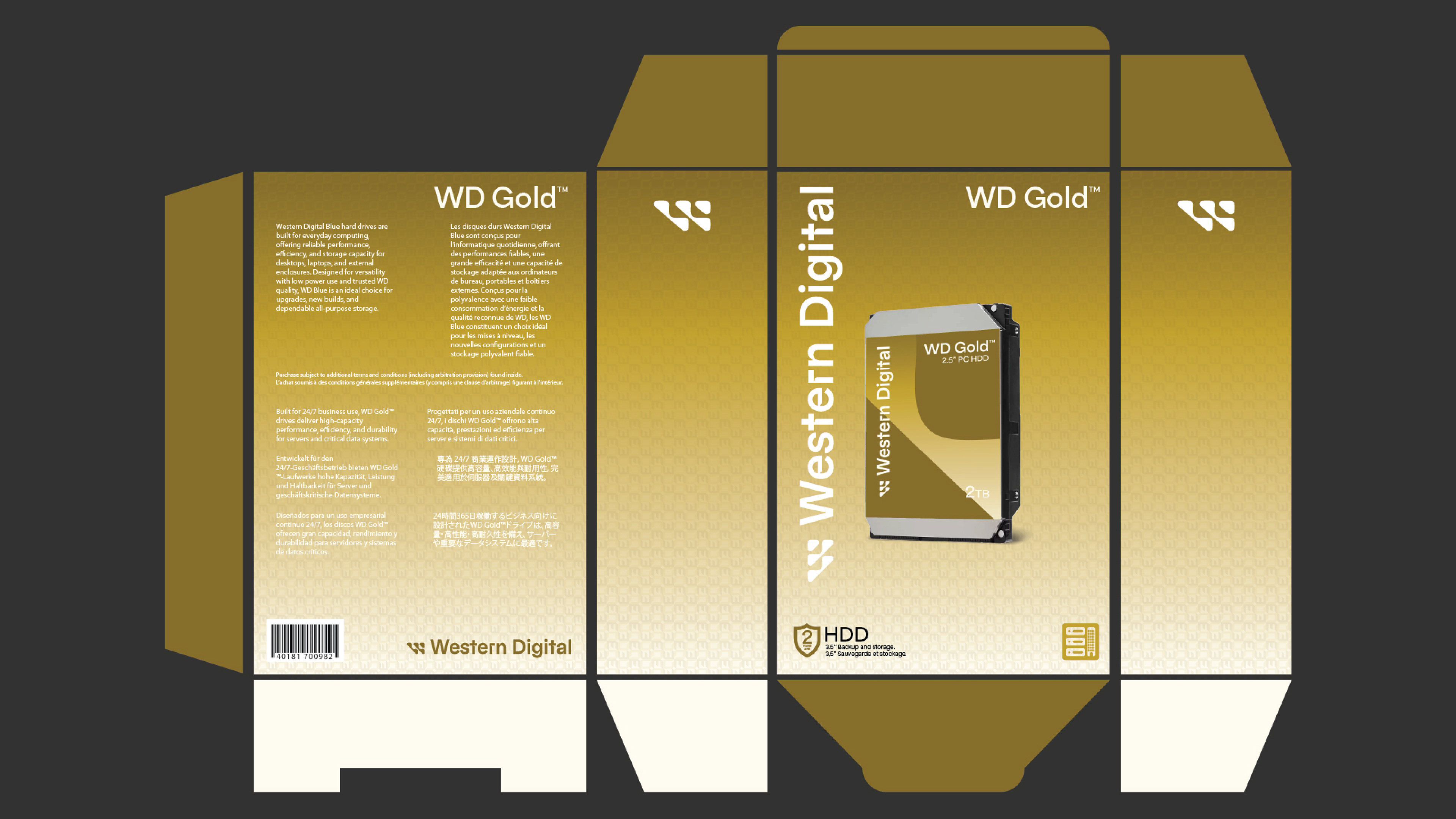
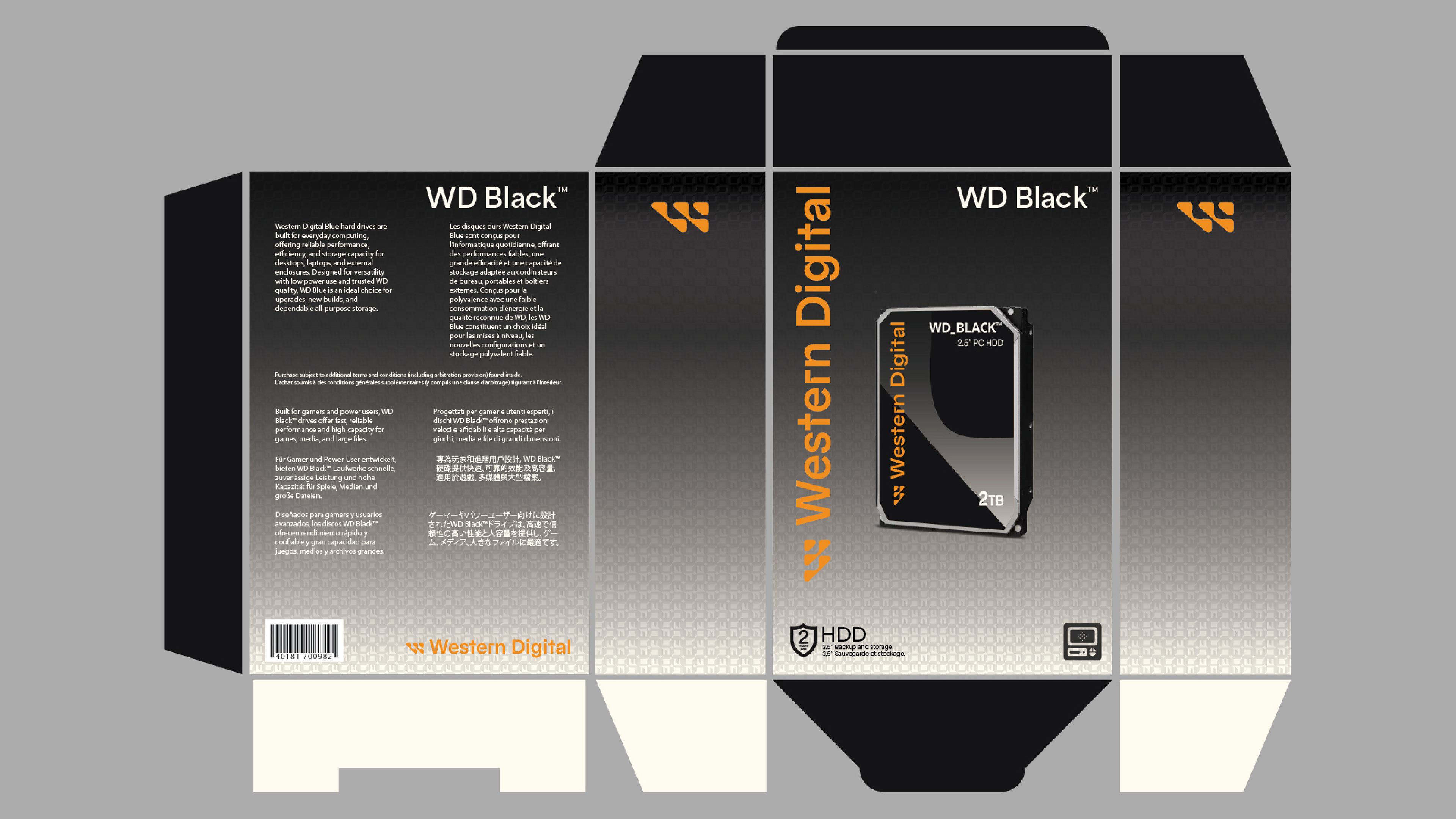
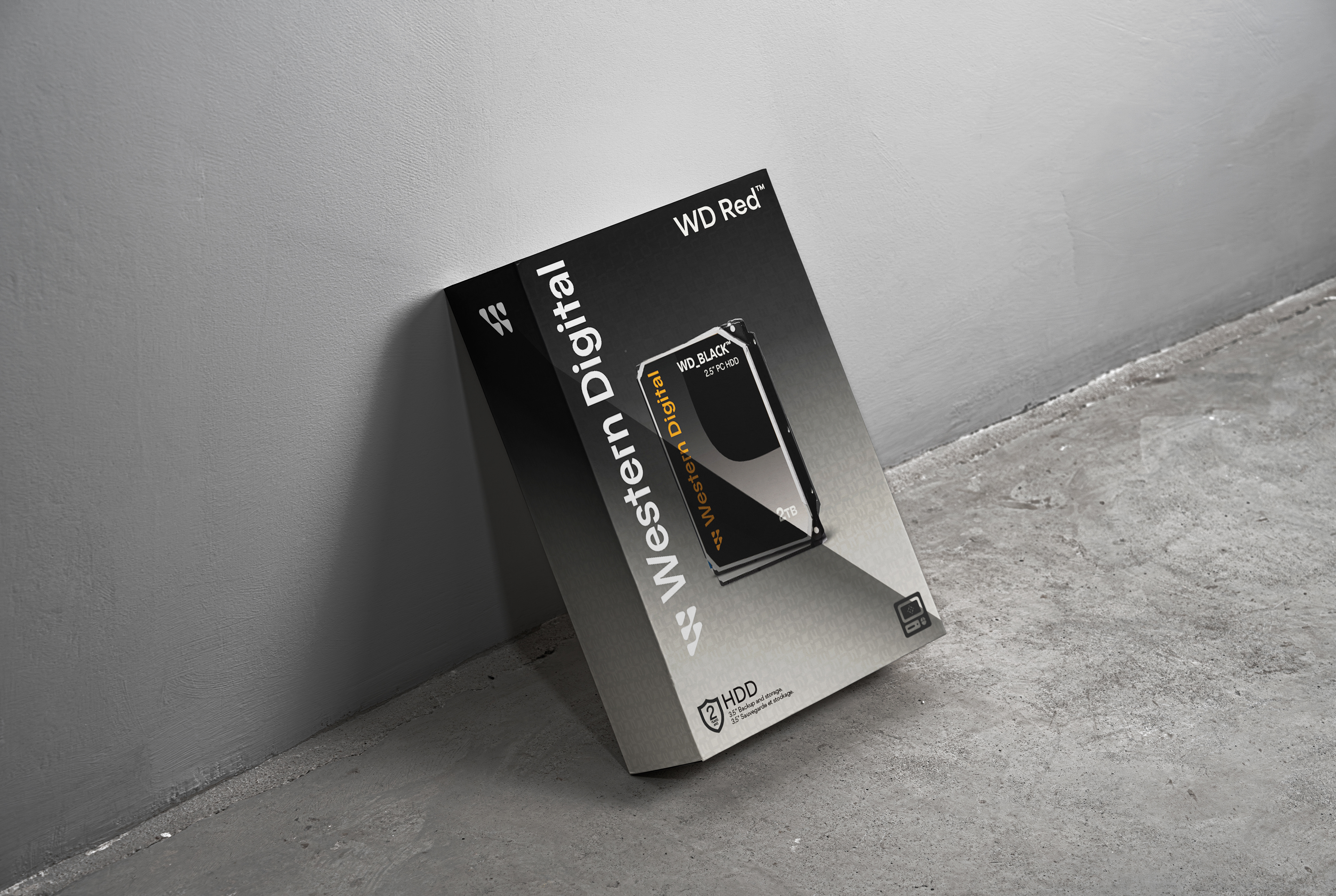
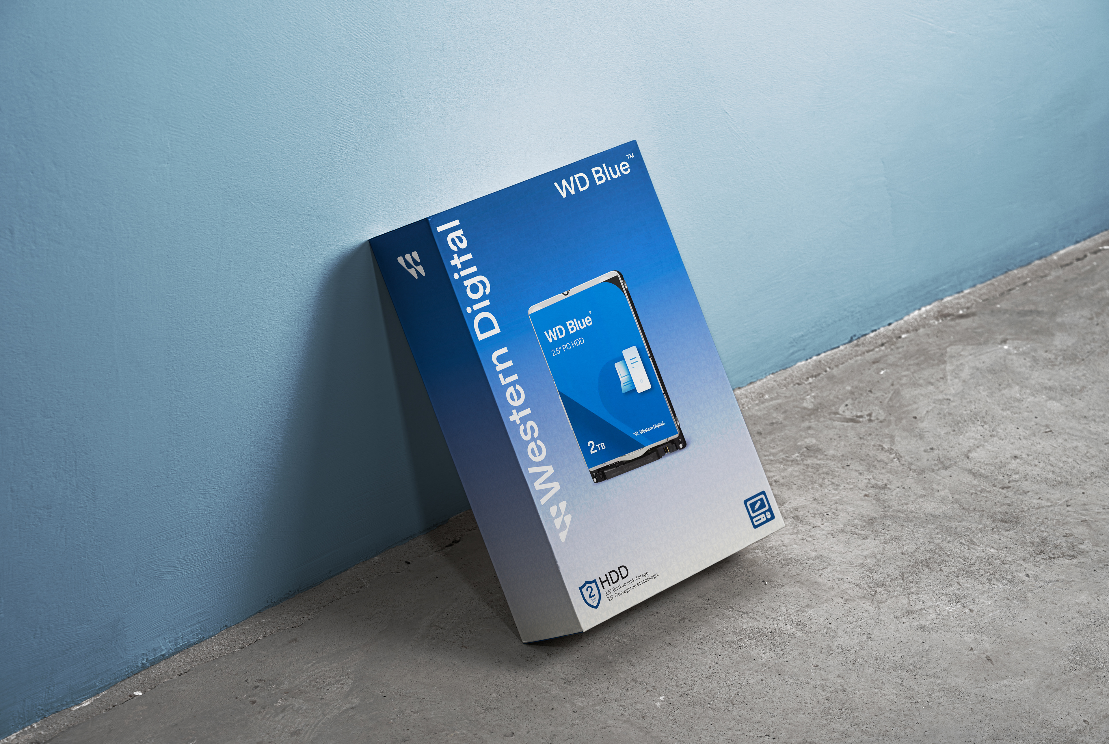
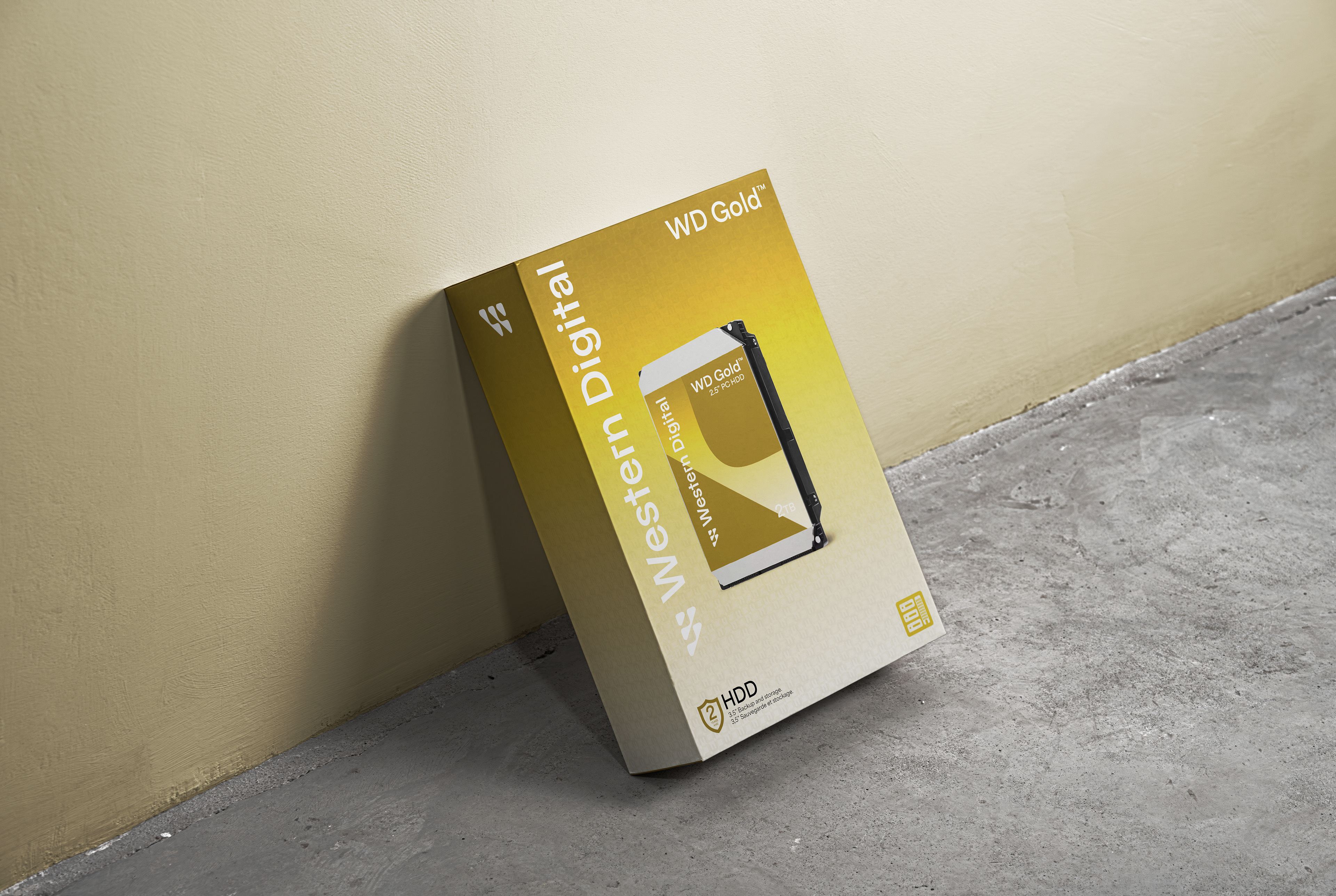
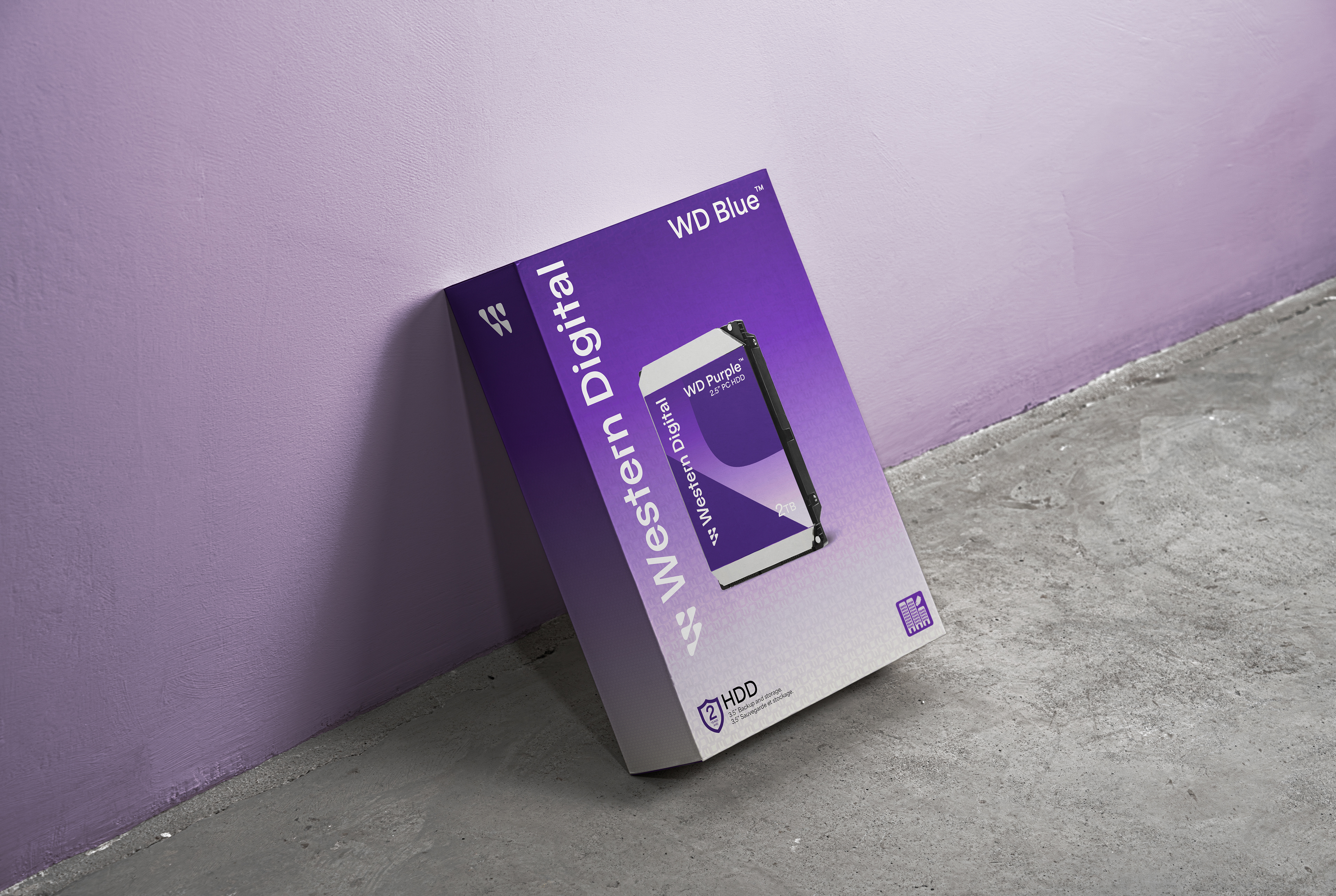
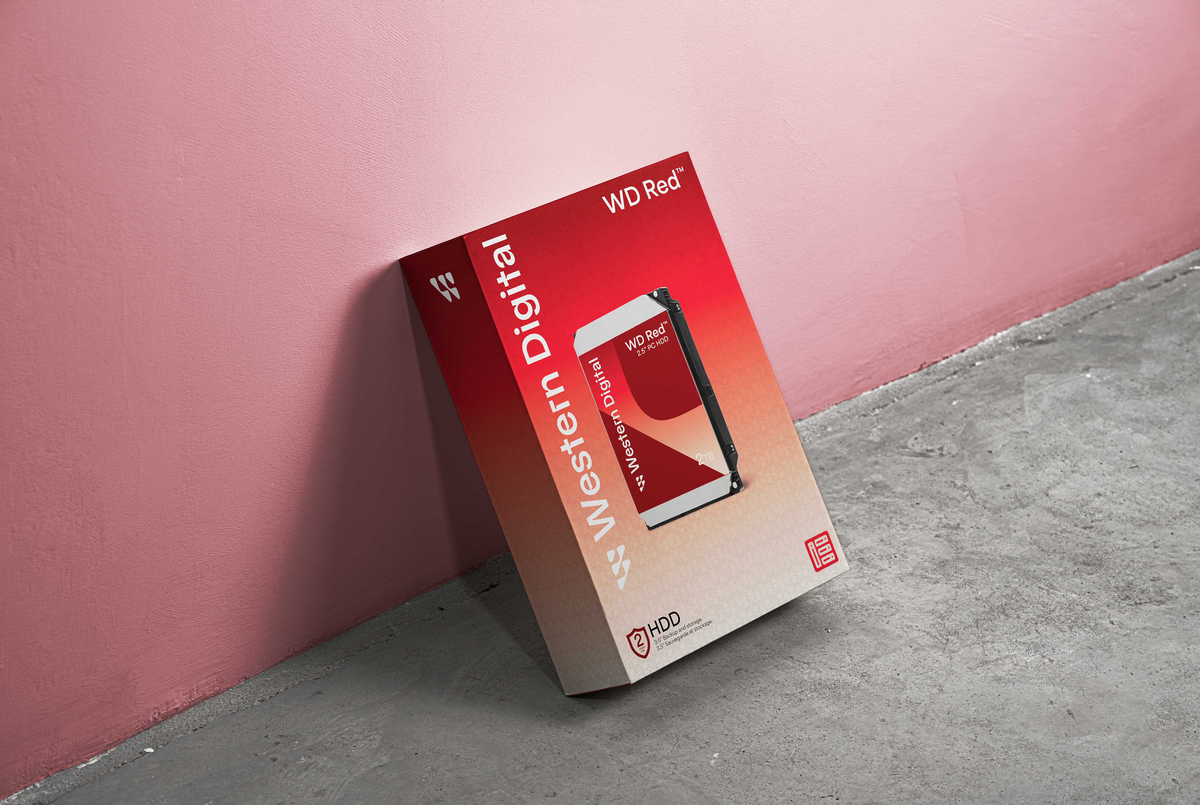
For this project, I redesigned the packaging for Western Digital’s line of hard drives. While their existing packaging is functional, I felt it lacked the visual energy and thoughtful design details needed to reflect the brand’s technological identity. My goal was to elevate the system through a refreshed visual approach while maintaining the clarity and reliability associated with Western Digital.
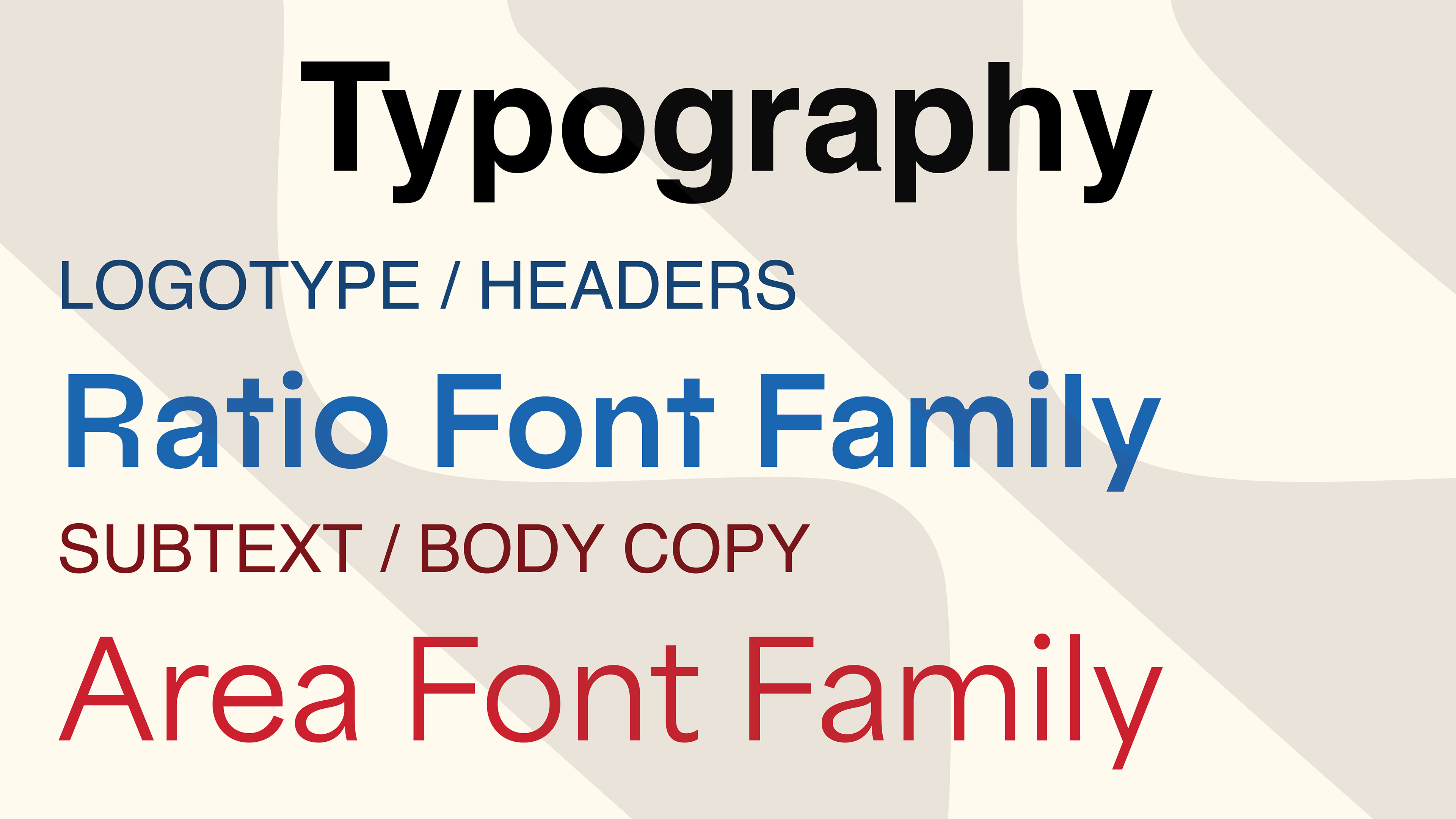
In addition to rethinking the packaging, I modernized the logo and updated the brand typography to use the Ratio type family. This choice allows the visual identity to more directly communicate the precision, structure, and digital-forward character of the brand. The refined logo and new typography work together to create a more cohesive and contemporary identity system.
I chose this product because of my longtime interest in computers and technology. Western Digital has been a staple in my personal setups for years, and this project provided an opportunity to bring my design sensibilities to a brand I genuinely value.
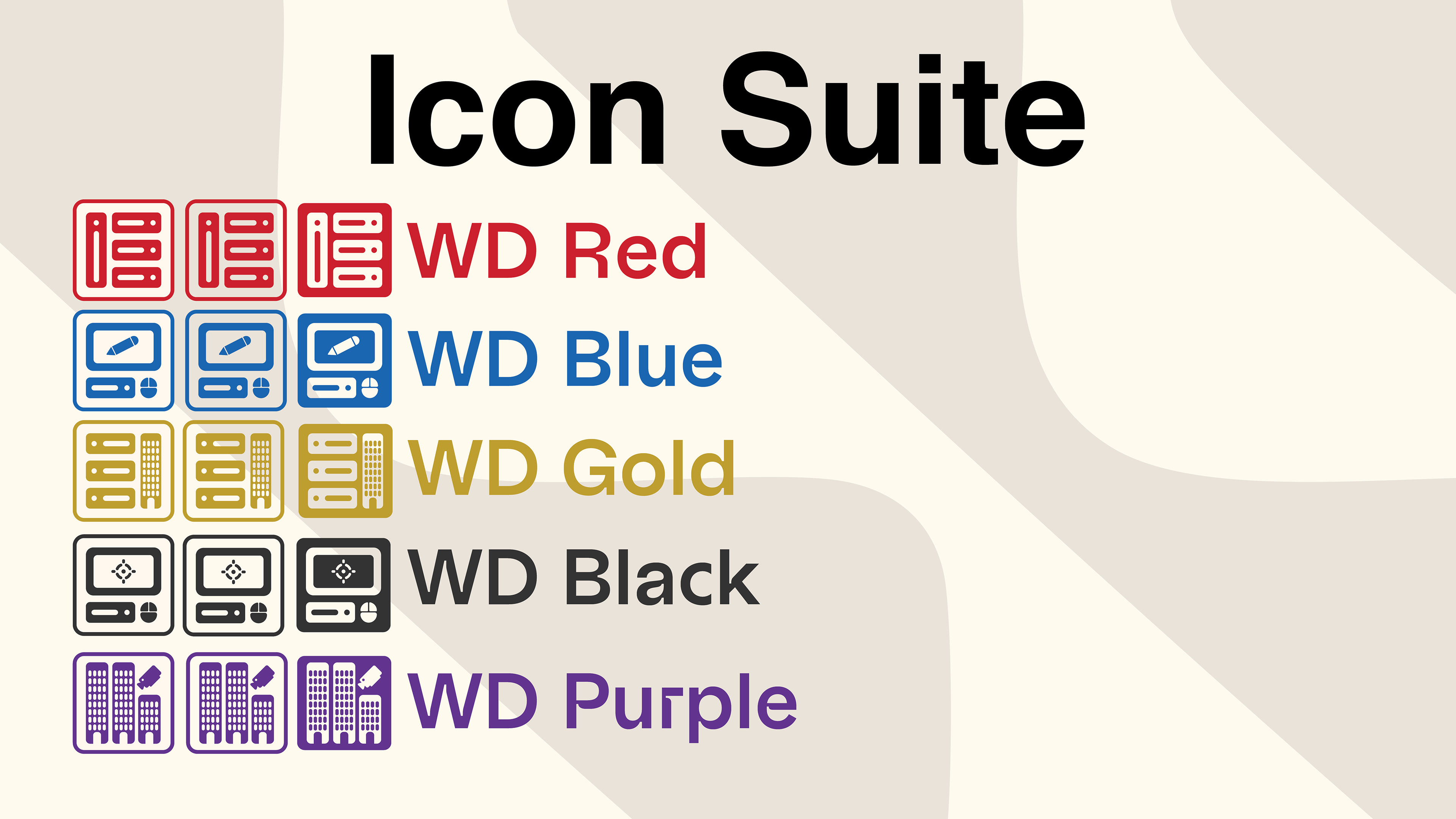
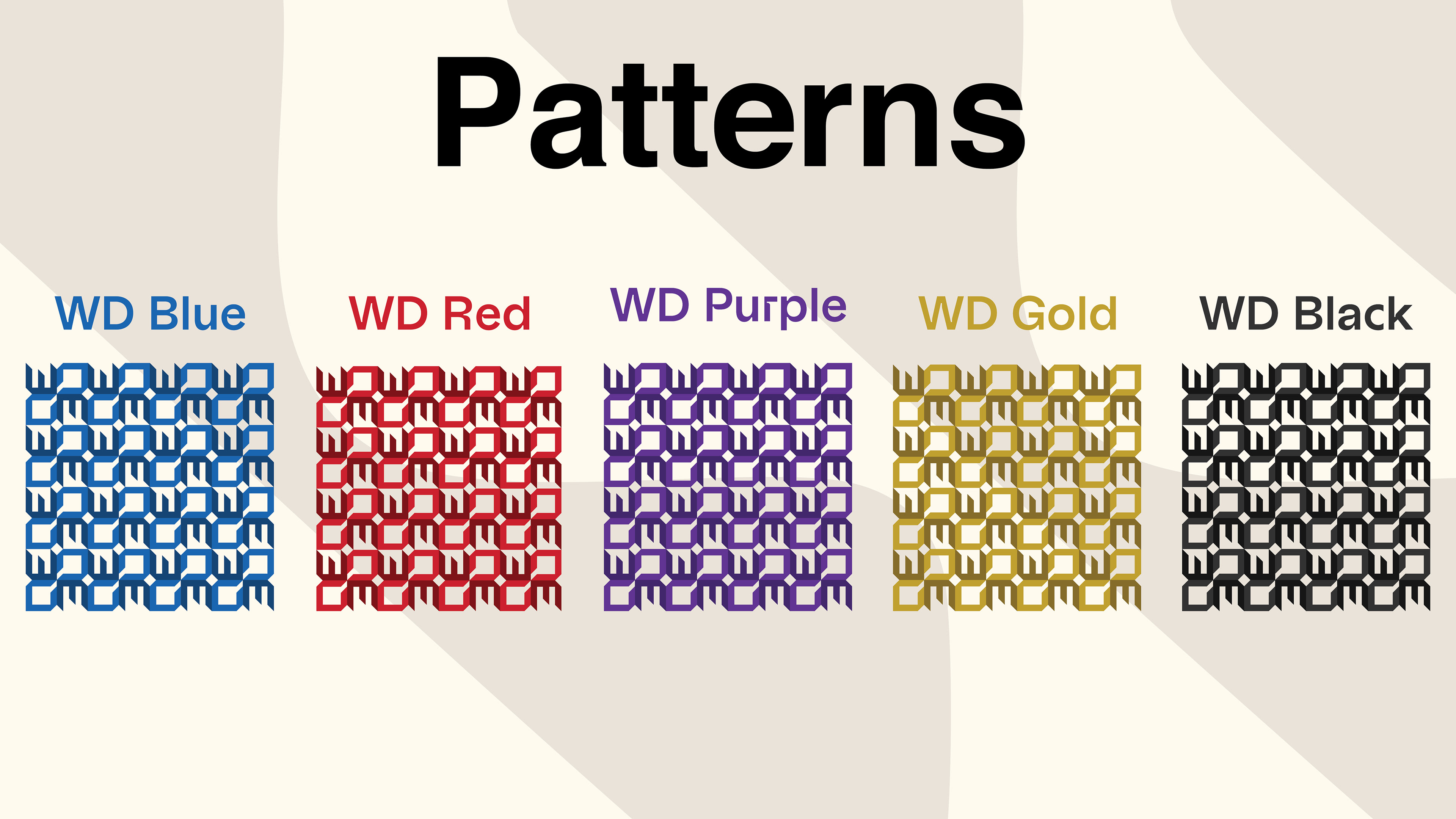
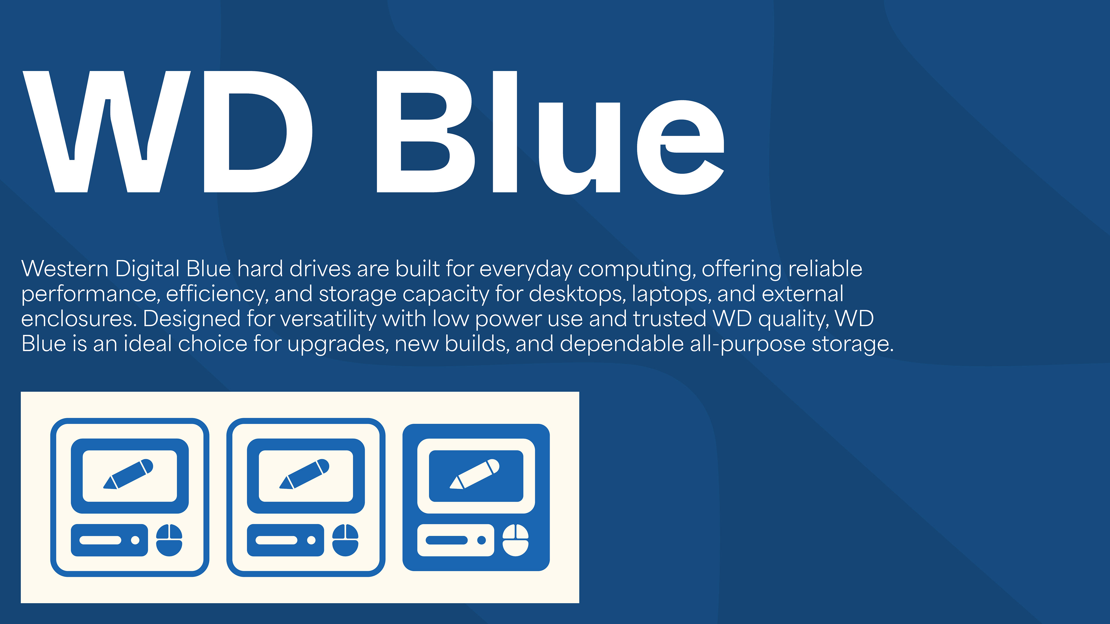
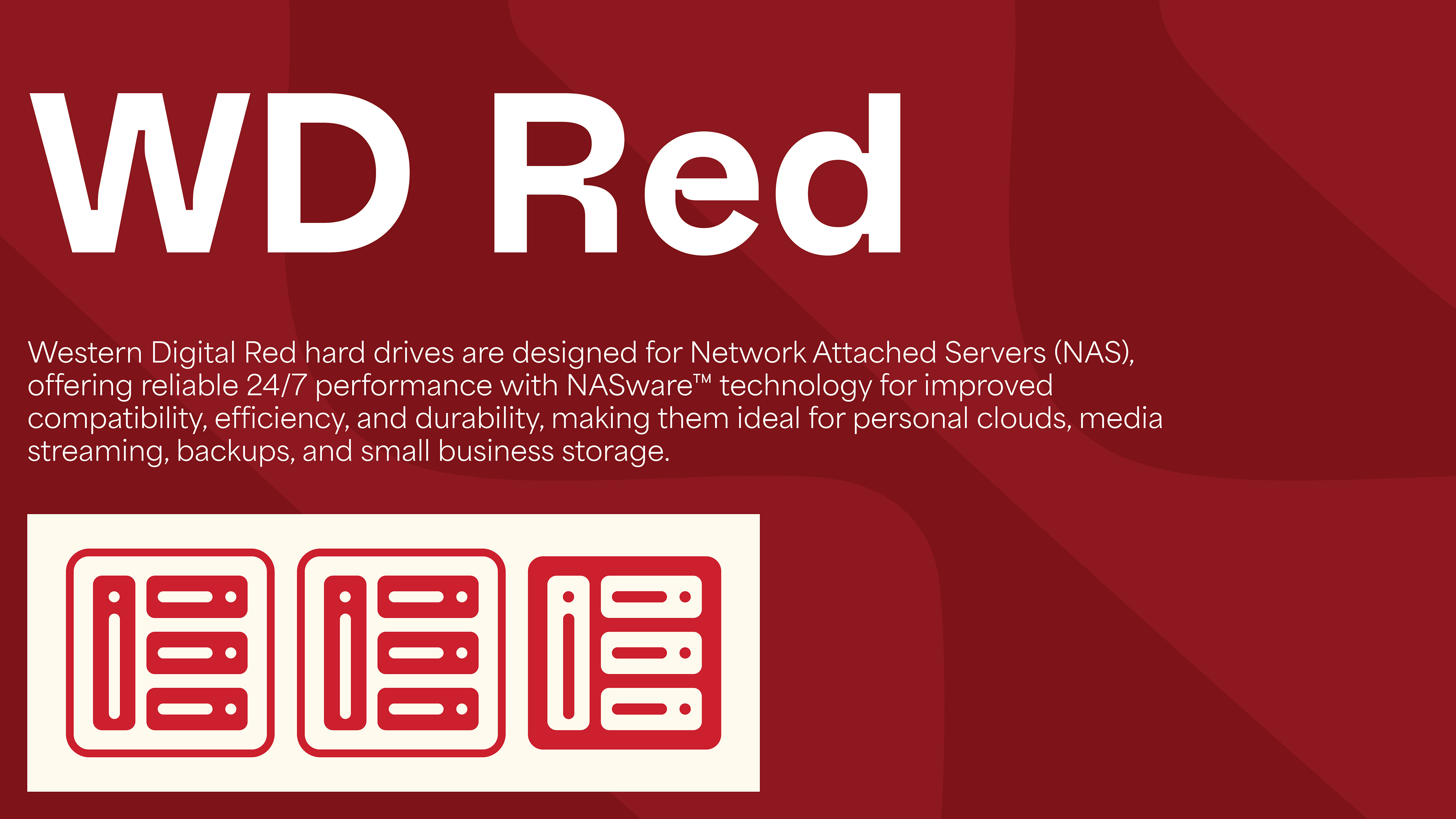
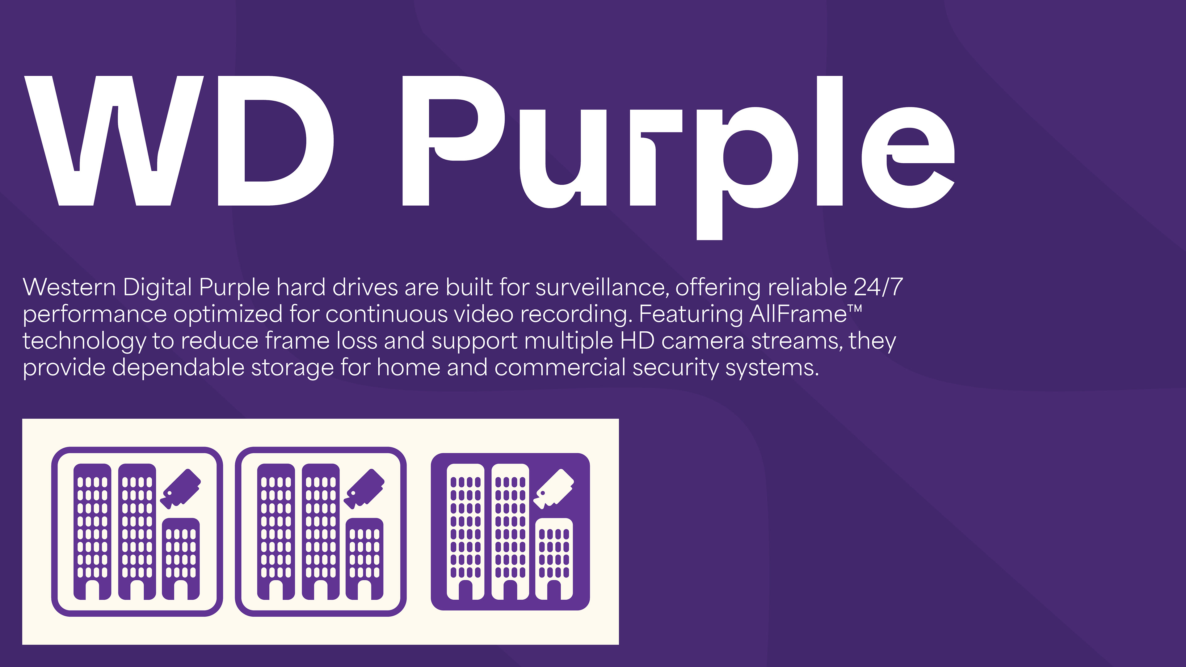
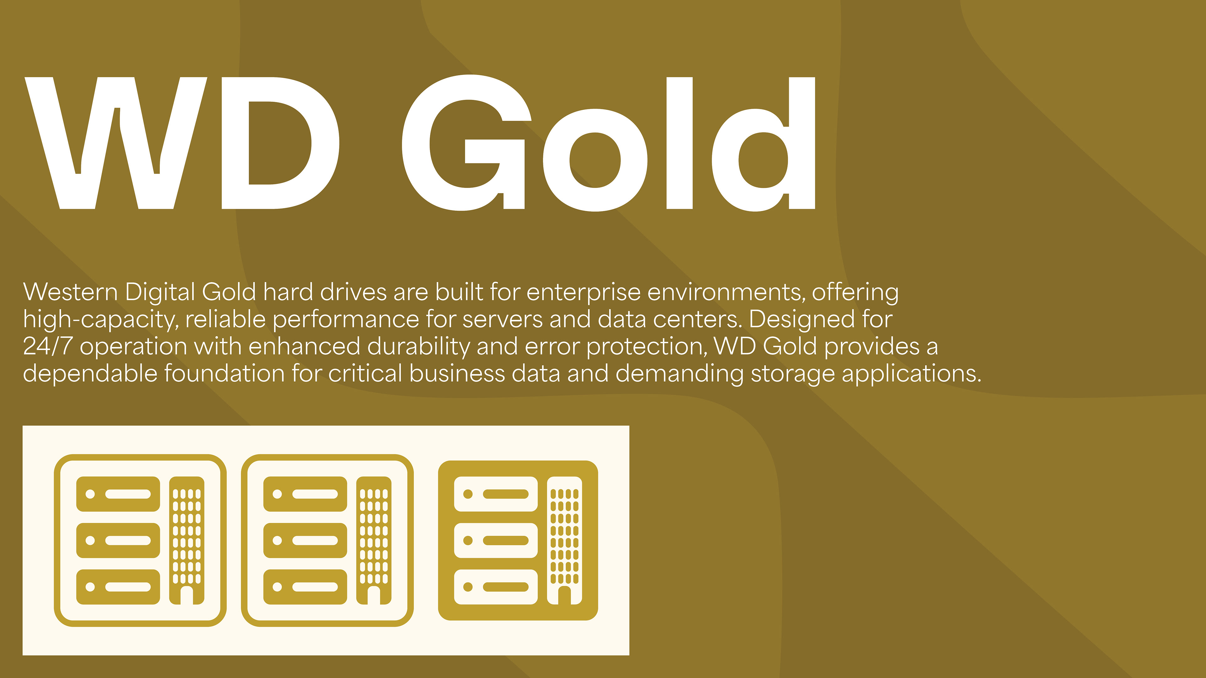
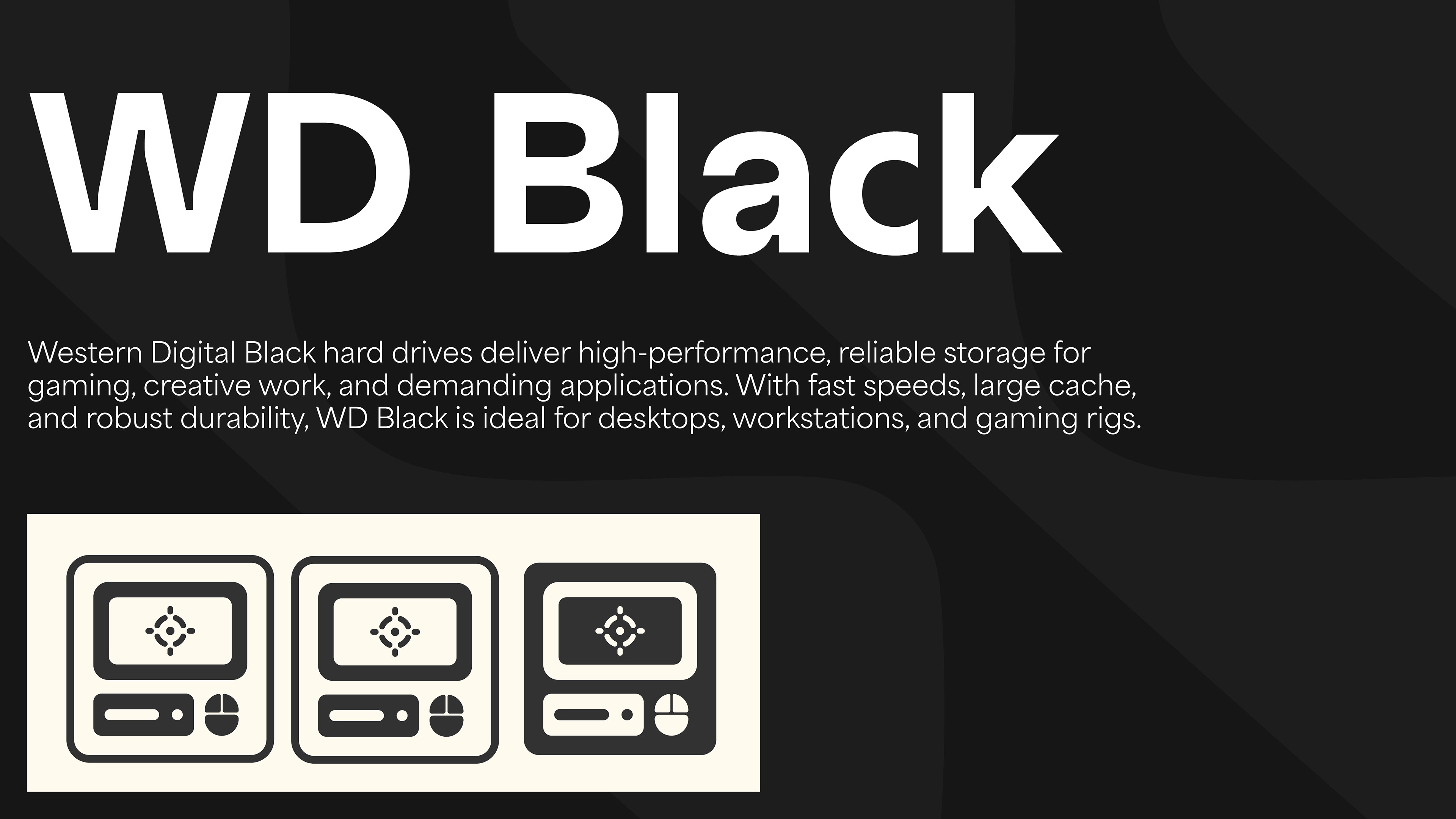
My redesign includes a refined color palette, an updated icon system that more clearly communicates each hard drive’s intended use, and a supplementary WD pattern that can function as a secondary graphic element throughout the packaging family.